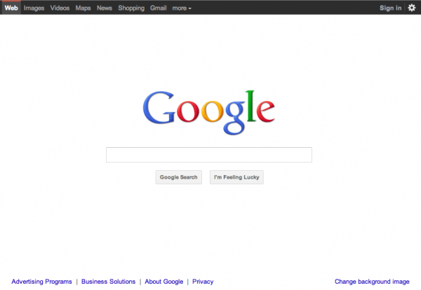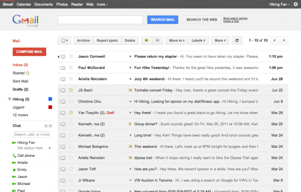
Google has, over the last number of days, been rolling out a new look for some of their more popular Web apps beginning with a modest change to their home page. Gmail and Google Calendar appear to be getting the same treatment (at least as a preview theme for now) which leads me to wonder if this was all due to the fanfare the Google+ interface has been receiving.
Taking Cues From Apple’s Success
Back in 2005 Google hired Andy Hertzfeld, a ‘former Macintosh wizard’ and one of the original designers of the Mac interface. Word has it that despite Larry Paige’s opposition to ‘lavish’ (or imho ‘good’) interface design, Andy was given free reign as the design lead for Google+. Maybe after seeing the favorable reception (at least by initial reviews) that Google+ has seen, Larry discovered that beauty AND speed can harmonize in the cloud.

More at: Google Blog, Gmail Blog, Google Calendar, Google+ Demo, Wired