Back in February of this year, Google signaled the changes they would be making to their algorithms for organic search results on mobile devices. Today, this change has officially been rolled out, but to what extent remains to be seen. Tech bloggers and Web developers alike began to prophesy of the ‘mobilegeddon’ that would result from Google’s change and that all should be prepared or suffer the wrath of penalized search rankings.
While it’s true, it would be ideal to be prepared for the initial launch of this change, it isn’t the end of world if you are not quite there yet. The change only affects the search rankings of smartphone browser results using Google and does not affect page rankings for traditional desktop browsers or even tablets. That said, with the growth in popularity of smartphones, it would be wise to get a move on with a mobile site to mirror your existing Web site or consider a responsive Web redesign that can automatically adjust to the screen resolution and operating system detected by your site.
Not sure if you’re mobile-friendly or not?
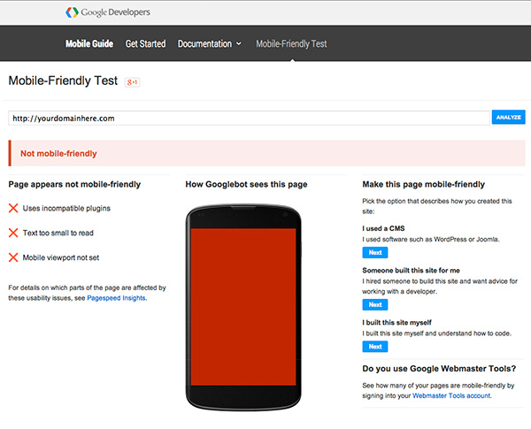
Google has not made this change and left us to die trying to find redemption. They’ve published a guide to mobile-friendly sites to help you determine your options for getting with the program, in relative layman’s terms. They’ve even provided a site that allows you to put your existing site through their own Mobile-Friendly Test. If after running their test, the result is “Awesome! This page is mobile-friendly,” you’re golden. If not, you’ll likely be presented with “Not mobile-friendly” and one or more of these statements: “Text too small to read,” or “Mobile viewport not set,” or “Links too close together,” or “Content wider than screen.” If that’s the case, it’s time to evaluate your options.
More than one way to get “mobile-friendly”
Rest assured, regardless of who or how your site was developed, you have options and time to get compliant. Once you’ve determined the state of your site, save yourself the heartache of figuring out what to do next. Pick up the phone and call 612-870-1940. Popular Content is experienced in developing both mobile-friendly companion sites as well as fully responsive, CMS-driven Web sites. We are ready and willing to discuss your options and develop a plan to make your site mobile-friendly in a timely and cost-effective manner. While it may not be the end of the world, delaying the inevitable may hurt your online presence in the end. Call or e-mail us today to get started.

